You are viewing 1 of your 1 free articles

The Sector Scorecard pilot results are in
The English housing association sector has a new set of benchmarking criteria. Now the results from its pilot year are in, what should landlords make of them? Illustration by Jeff Wack
Policy developments and some negative media attention in recent years have led the housing sector to want to be able to present its own evidence and tell its own story of its efficiency and impact.
The result is a whole new set of benchmarking criteria: the Sector Scorecard.
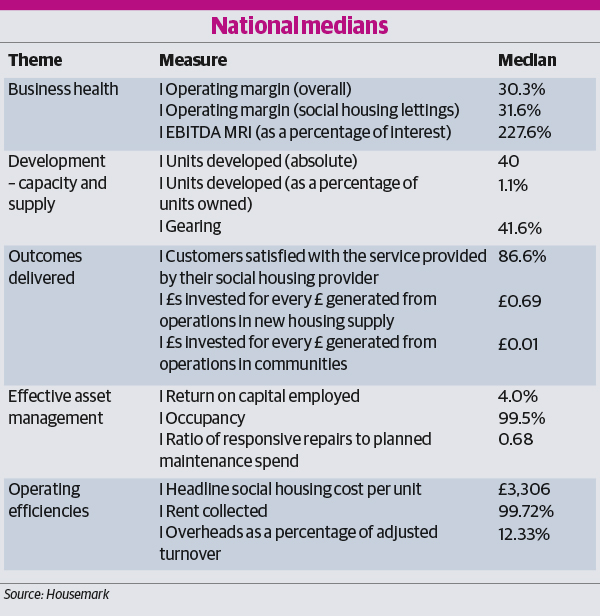
Starting in 2015, a working group of representatives from 15 English housing associations has been developing a set of 15 indicators across five themes (see below) to benchmark efficiency across the sector (see table: National medians).
An analysis report, which will be published next week, details the results of a one-year pilot of the measures in 2016/17.
READ MORE


It uses quartiles to show how scores are distributed across all participants. The median – the mid-point in the data – gives a benchmark for what is ‘average’ for the sector for each indicator. Participating associations can analyse their own figures against this sector-wide view. But what do the results tell us and how can landlords benefit from the exercise?
The report is based on data collected from 315 housing associations managing a combined total of 2.4 million homes – more than 80% of the UK’s housing association stock.
The landlords, based across the British Isles (90% are in England), vary in size, with turnovers ranging from under £100,000 to more than £450m.
“The scorecard is by the sector for the sector.”
The number of homes they manage ranges from fewer than 100 to more than 60,000, with the majority being general needs.
Mark Henderson, chair of the Sector Scorecard Working Group and chief executive of Home Group, says the high level of participation shows that organisations are prepared to be open about their approach to efficiency.
“They are clearly taking value for money very seriously indeed,” he says.
The scorecard is “by the sector for the sector”, he adds, and allows associations to compare themselves with other organisations and “ask questions” about their own relative performance. “It’s a move to the ever-increasing transparency the sector has been championing for many years now,” he says.
In the absence of a comprehensive set of figures, associations are “vulnerable to random statistics being picked out of the air”, adds Mr Henderson. “[The scorecard] allows us to tell the story about what it is we do and why we do it.”
Here is a guide to the results from the pilot, divided into the five main Sector Scorecard themes:
1. Development - capacity and supply
Associations taking part in the Sector Scorecard completed 39,776 new homes in 2016/17, according to the data they supplied. A total of 241 landlords recorded completions, with the largest developer building 2,266 homes and a further five organisations delivering more than 1,000 homes each.
While associations in London built the highest total number of units at 7,566, the East Midlands recorded the highest average number of homes developed per organisation, with 13 associations completing a combined 2,598 homes.
A gearing indicator shows the proportion of borrowing in relation to the size of an association’s asset base. The median ratio is 41.6%, with larger organisations tending to be more highly geared than smaller ones, and developing landlords more than those not building.
A low ratio could indicate that an organisation has capacity to leverage existing assets to provide funds for development or services but a high ratio could mean it has taken on too much borrowing and this could put assets at risk.
A gearing indicator shows the proportion of borrowing in relation to the size of an association’s asset base
Sinéad Butters is chief executive of 8,500-home Aspire and chair of Placeshapers, a network of more than 100 housing associations which is represented by two members in the working group. She says the Sector Scorecard gets organisations asking questions such as whether a high gearing ratio is good or bad.
Aspire, which sits in the top quartile for seven of the Scorecard’s 15 indicators, is in the “bottom” quartile for gearing (although the measure does not imply a value judgement) as the association’s ratio is “particularly high” due to it being a debt-funded large-scale voluntary transfer. “We are proud of that in a way because it shows we are trying to do lots,” says Ms Butters.
Aspire’s board will use the scorecard as a corporate planning tool. “I am sure in its operation there will be teething problems or some organisations which look different when compared because of their particular characteristics, but that is an opportunity to open up that discussion,” says Ms Butters.
It is a chance to better understand associations’ differing models and financial arrangements, she adds.

Mark Henderson, chair of the Sector Scorecard Working Group
2. Business health
On business health, the report paints a positive picture. The median operating margin – which measures the amount of surplus generated from turnover on an association’s day-to-day activities and can be affected by factors including the amount of rent charged and spending on maintenance – is 30.3%.
The report suggests this compares favourably with private companies that perform development, property management or maintenance functions. It adds that the “strong” performance is testament to associations’ response to the annual 1% rent cut for four years announced in 2015 and the “generally challenging operating environment”. The sector is also dealing with the threat to income posed by welfare reform, the need to build new homes and asset management for existing homes.
“It’s good to see that’s a figure that shows the weathering of the storm but I think we have got to be sensible about not rushing to too much judgement because we have still got a couple more years of minus 1% to face, so those margins are under pressure,” says working group member John Delahunty, chief executive of 550-home Innisfree.
Geographically, Scotland has the lowest median, of 23.1%, which could be a result of lower average rents. The East of England has the highest at 35.8%.
Large-scale voluntary transfer organisations founded less than seven years ago recorded lower margins, which corresponds to the higher costs associated with the creation of an LSVT noted by the Homes and Communities Agency last year.
Associations with large proportions of supported housing or housing for older people also tended to record lower operating margins – by around 10 percentage points.
3. Outcomes delivered
Whatever their landlord’s model, typically between eight and nine tenants out of 10 are satisfied with the service they receive: the national median is 86.6%. Tenants are happiest in Scotland and the North East of England, where scores are 91%; landlords in London recorded the lowest median rate of 78.3%.
Stephen Russell, director of commercial services at Housemark – which produced the report and, along with Acuity, collected the data – points out that there is a different regulating regime in Scotland and that “factors over and above the performance of the landlord” are known to influence satisfaction results.
These include how urban an area is and the levels of flat accommodation, black and minority ethnic residents and younger residents.
Tenants are happiest in Scotland and the North East of England
For every pound generated from their operations, associations invested a median of 69p in new housing supply during 2016/17. Seventy-three landlords invested more than £1, which the report suggests “indicates the commitment of the housing association sector to solving the housing crisis through stretching their resources and building new homes”.
The highest result was £10 per £1 generated, although 44 organisations reported zero investment. By comparison, for every £1 generated, organisations invested a median of 1p in communities.
“Investing in new supply is inherently capital investment – it uses an awful lot of resource – so we would expect it to be a much higher number,” says Nick Yandle, policy leader at the National Housing Federation (NHF), which is supporting the ongoing governance of the scorecard by overseeing the creation of a new advisory board. “Investing in communities doesn’t require anywhere near the same level of capital investment.”
That being said, he suggests the community investment figure is “not necessary a fair representation” as it was a new measure and there were issues with the definition.
In 60 seconds: the deregulation of English housing associations
4. Effective asset management
As well as investing in new homes, associations must manage existing stock.
At a median of 4%, return on capital employed is “comparatively low” compared to private sector companies but the report suggests this can be partly explained by the fact housing associations charge sub-market rents, “which effectively places a cap on returns”. They cannot maximise their financial return but are “strongly motivated by the delivery of a social return”.
Planned maintenance is considered the most cost-effective way for landlords to maintain homes and the report found most are spending less on responsive repairs than planned works. The median point for the ratio of responsive repairs to planned maintenance – calculated by dividing spending on routine maintenance by the sum of planned work, major repairs and capitalised major repairs – is 0.68.
Mr Delahunty suggests that some scorecard measures will be subject to changes from year to year
Innisfree’s better ratio of 0.52 generated “fresh conversations” among its board.
However, chief executive Mr Delahunty suggests that some scorecard measures will be subject to changes from year to year. “Sometimes you have expensive years,” he says. “With cyclical programmes of work you expect to have higher revenue expenditure because the time’s come round for some expensive schemes to be painted or something like that.
“I think trends over time will be really important and we do need to be ready to be patient because of that. We shouldn’t be rushing to absolute judgements.”
5. Operating efficiencies and next steps
Associations typically spend £3,306 a year managing and maintaining each of their homes, but location has an impact. London landlords have the highest median cost of £4,995, which Mr Russell says is probably partly driven by higher wages, while associations in the East Midlands have the lowest, at £2,605.
Lower stock size does not necessarily lead to higher costs, but having a large proportion of supported housing or housing for older people does: landlords in these situations have a median cost per unit of £5,154 and £4,994 respectively. The age of an LSVT also has an impact.
No association achieved more than nine results in the best quartiles across the 15 indicators. Around 9% of organisations had seven, eight or nine results in the best quartile but, typically, an association achieved top results for three or four measures. The report notes, however, that for some measures, such as gearing, it is not always appropriate to assume one result is better than another.
The Sector Scorecard Working Group may tweak some measures
“The differences in performance and [the fact] that there is no particular organisation that dominates across the board emphasises and reinforces that message around diversity [in the sector] and that diversity is legitimate.
"We need to take a much more balanced view and depending on organisation type and mission – and, to some extent, location – that is going to influence different performance measures in different ways,” says Mr Yandle of the NHF.
He says results from the pilot are consistent with previous analysis but the scorecard brings the data together in one place in a consistent way. It also tells a “strong narrative”.
“The efficiency statistics combined with the stuff on impact and supply show that the sector took a few hits through the rent cut and some other policy decisions but, rather than respond by rolling back on investment or reducing output, [it] actually rose to the challenge and essentially looked at what it could do to maintain and then increase its impact, even though income was being reduced.”
The Sector Scorecard Working Group is evaluating the results of the pilot and may tweak some measures, or potentially add new ones on the back of the Social Housing Green Paper, before fully rolling out the Sector Scorecard next year.


